THE SONNETS
Limited edition
FROM TATA COFFEE
TATA Coffee - a leading player in the B2B coffee market, wanted to launch their premium range of speciality coffee brand in the D2C sector.
Launch press release:
They turned to us to create the brand story with focus on its premium quality and sustainability. The branding exercise was targetted towards its first launch - a limited edition of premium microlot coffees, which eventually paved way for a future range of products under The Sonnets' umbrella.
Brief:
1. Come up with a brand name for the collection.
2. Build the brand from scratch and form the brand story.
3. Design a highly premium packaging system for the first launch.
To approach this project we took insights from the brand workshops. We added market research, competitor landscaping and analysis eventually which lead to the buildup of the brand persona, structure and positioning. The combined data gave us a solid base to ideate and execute our concepts.
CARD SORTING EXERCISE TO FIND BRAND ATTRIBUTES

BRAND QUALITIES
HIGH END
SOPHISTICATED
PREMIUM
CLASSY
CLASSIC

BRAND WAS NAMED:
The Sonnets
Sonnets are poems of a definite rhythmic pattern. The premium and specially crafted microlot coffee is as unique and celebratory as a poets creation.
TAGLINE:
VOICE OF OUR ESTATES
SUB TAGLINE:
RESERVE SINGLE ORIGIN COFFEES FROM TATA
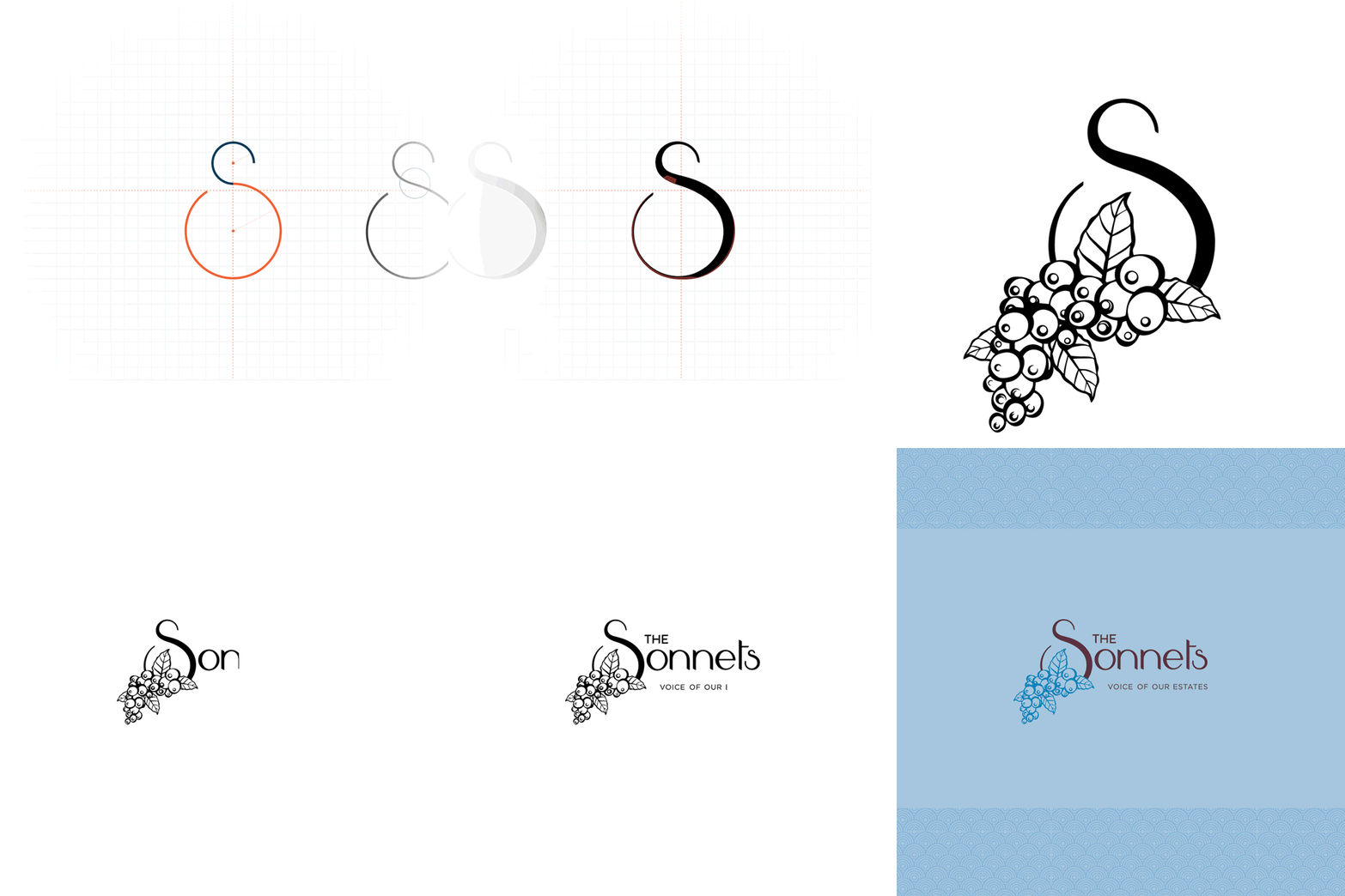
LOGO FORM: STEP BY STEP


The logotype was inspired by early English sonnet manuscripts, the ornate initial letter being their trademark touch.
It has got some delicate curves and some old school illustrative element. Each curve of the logotype was carefully crafted to match the poetic mood that the brand wanted to convey. Starting from the intricate patterns to the 'estate story' writeup, adheres to this mood to create a cohesive brand feel.

BRAND BOOK

PRODUCT PACKAGING
Initial explorations
We made multiple prototypes of the units before finalising on one and sending them out for production. In the process we explored many different paper types, print fabrication techniques and their light bouncing properties.


Every coffee is unique.
Every coffee has a story of its own.
Each one of the variants of The Sonnets coffee are unique because of their particular estate and the subsequent climatic condition they are collected from. A designated spot on the box was assigned to tell the story of the beautiful estates they come from and the sustainable system that runs within these estates.


STYLE ELEMENTS


